
The brief for Riveraine Olive Oil was to design sophisticated and minimalistic packaging in order to emphasise its artisanal quality and premium nature.


Design Rationale
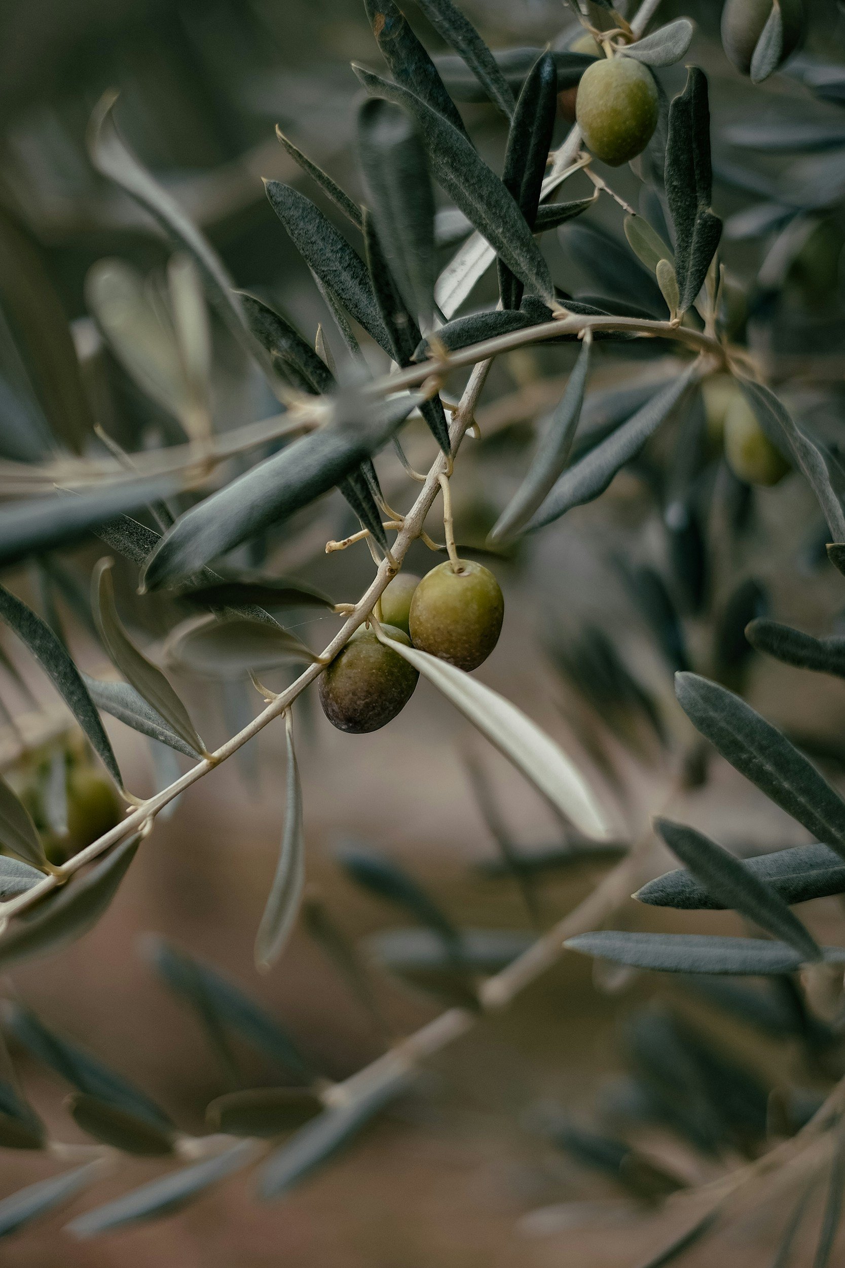
A palette of white, beige, and black is used to create a refined and elegant look. The white background provides a clean canvas, allowing the text and illustrations to stand out clearly. The use of a dark-colored bottle not only protects the olive oil from light but also adds to the premium feel of the product. A combination of classic serif fonts for the brand name and product description, and sans-serif fonts for supplementary information achieved legibility with timeless design. The serif font conveys tradition and craftsmanship, while the sans-serif font adds a modern touch. The text is balanced, with clear hierarchy to guide the consumer's eye from the brand name to the product features and details. A hand-drawn style illustration of olive branches is used to emphasise the natural and artisanal qualities of the olive oil. The black-and-white illustration adds a touch of elegance and authenticity without overwhelming the design. The Riveraine Farm logo is prominently placed at the top, establishing brand identity and recognition.