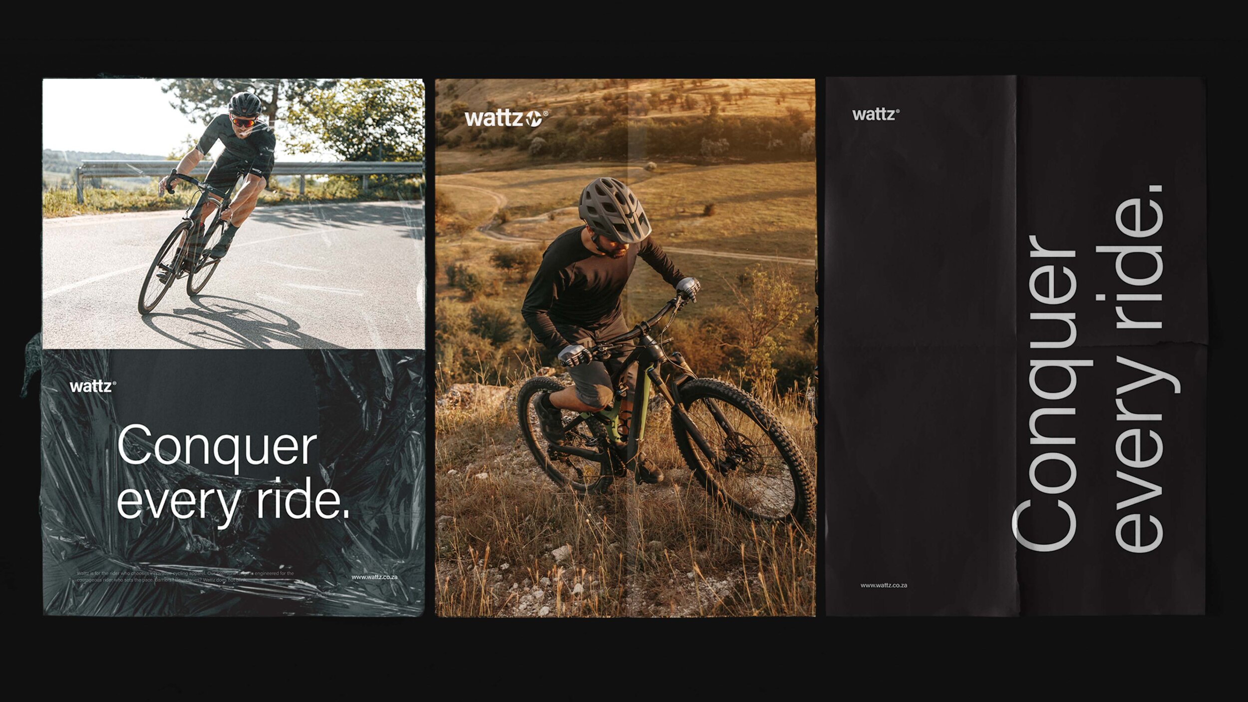
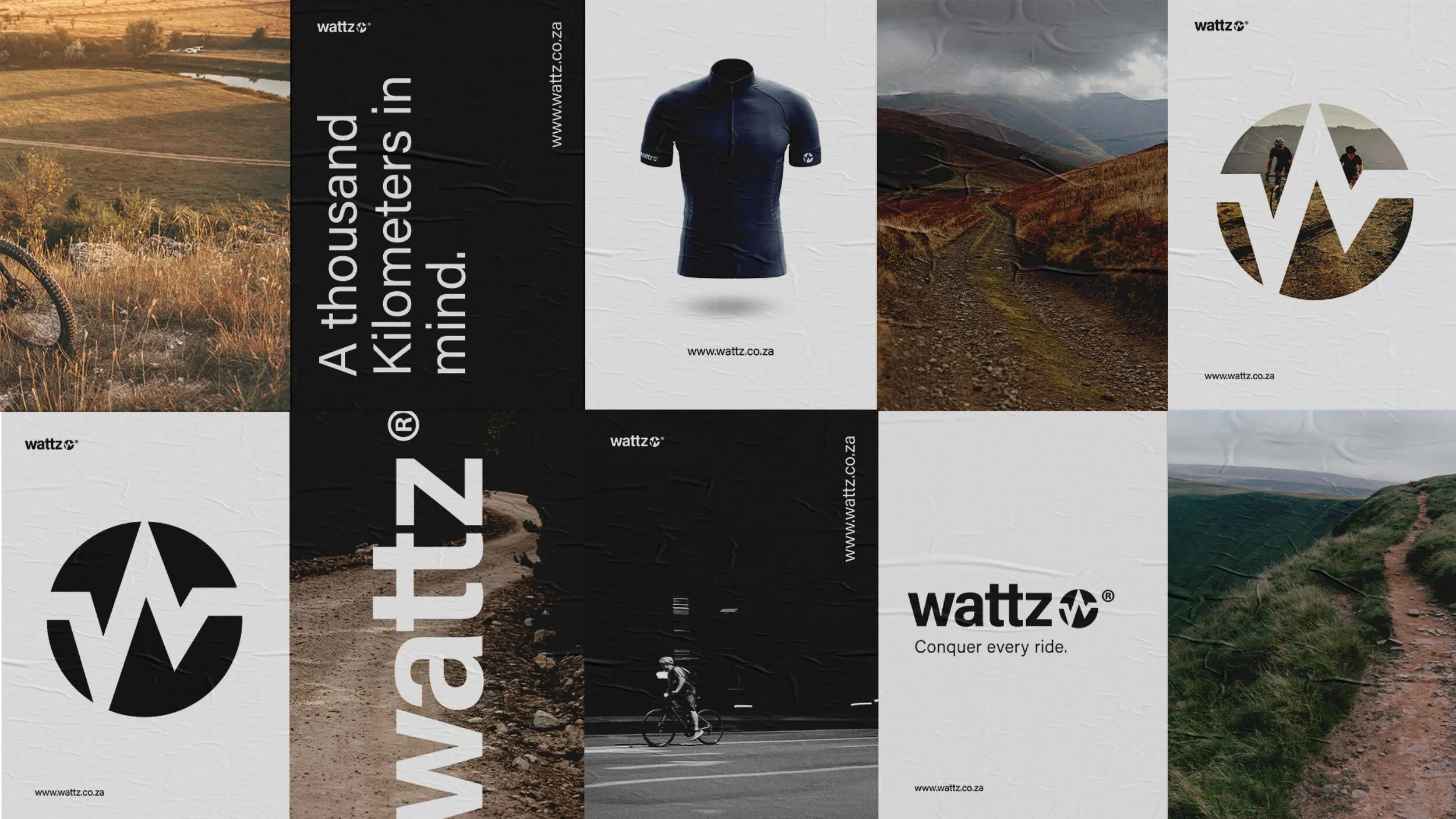
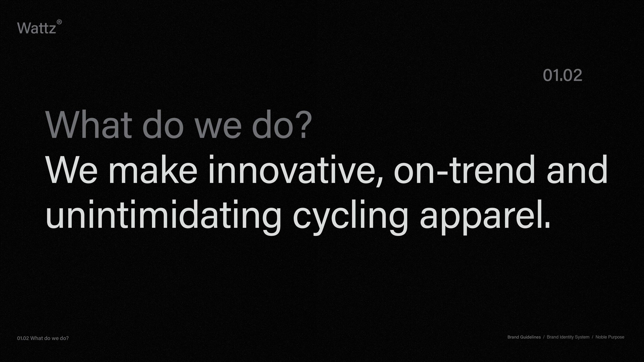
Wattz Cycling Apparel Brand Refresh | Wattz is Cycle Lab’s flagship apparel brand for the spirited rider who sets the pace.
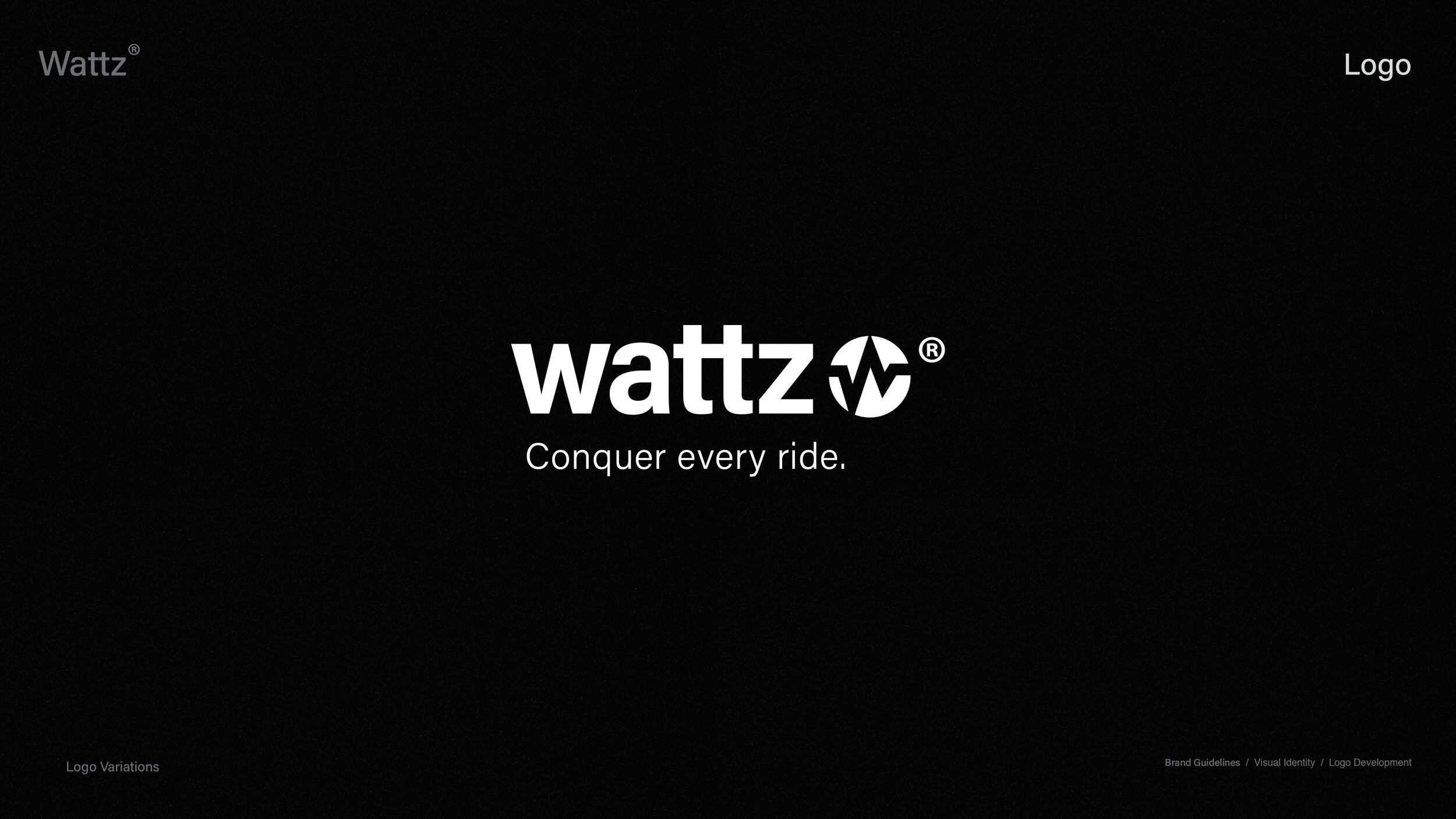
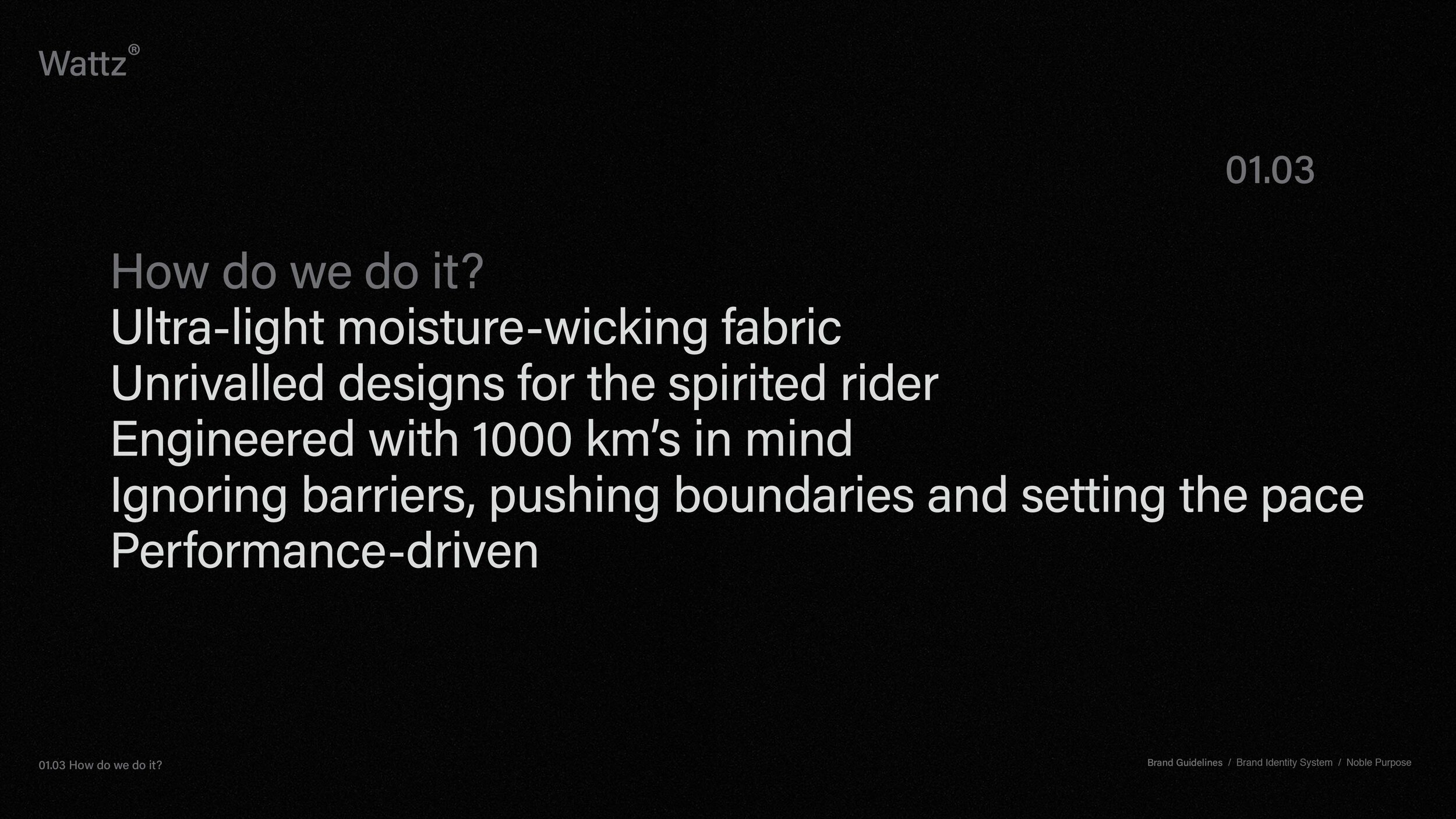
“We’re dedicated to our craft, engineering premium gear that makes you hungry for more. Our cyclists conquer every ride and look sharp while doing it.”

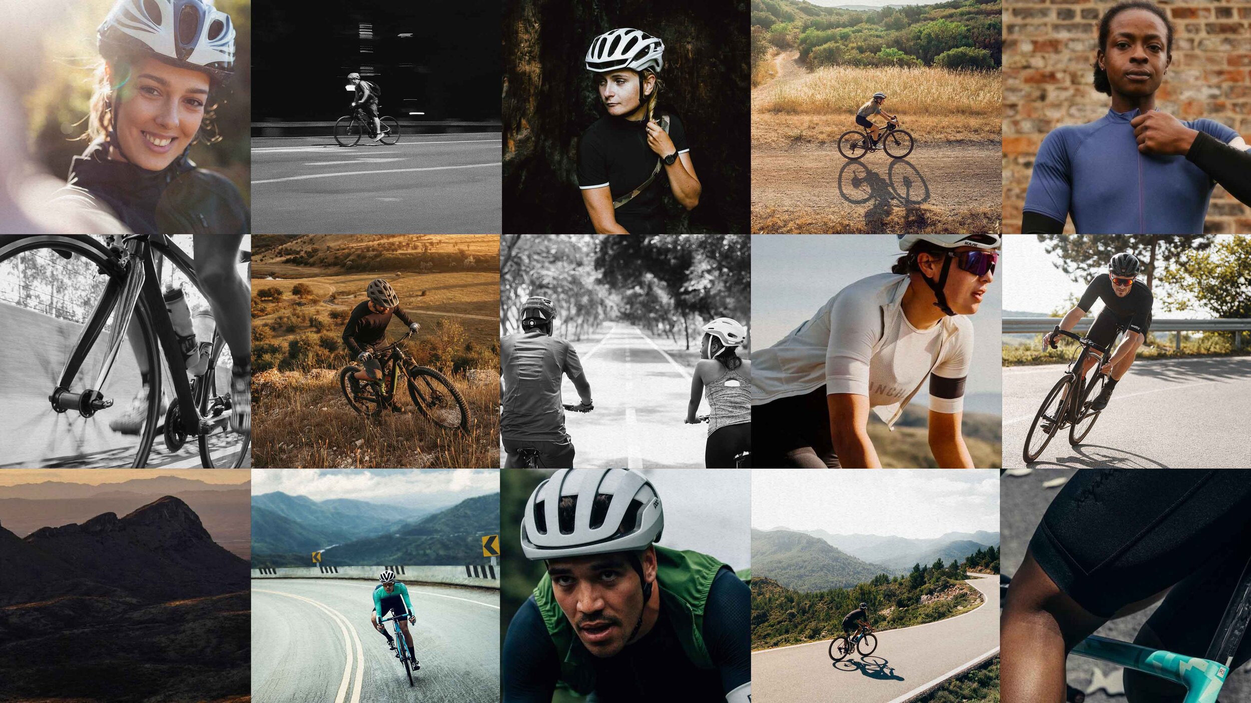
Cycling is a growing sport in South Africa and Cycle Lab is servicing a gap in the market for quality gear at a competitive price. Nectar was tasked with developing a brand that has the quality of existing market leaders but also has an unintimidating feel to include riders at any level. The brand also needed to match the sleek, bold designs and fabrics of the apparel refresh.
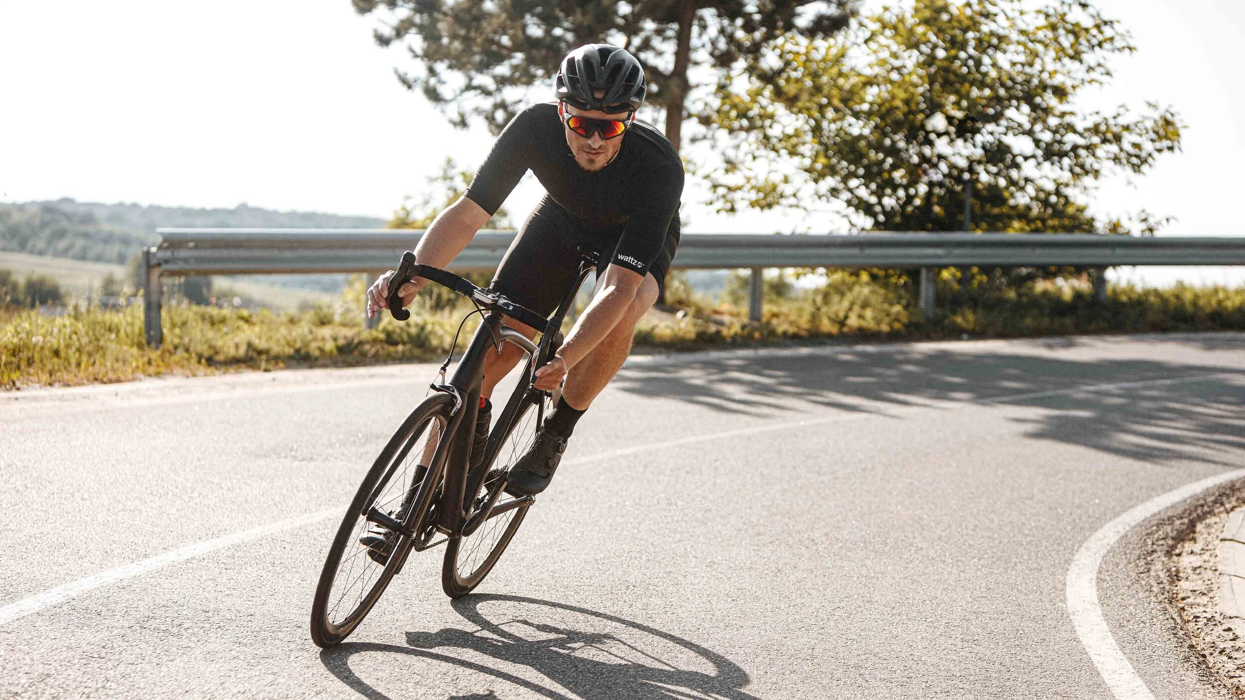

Eye-catching and edgy. Unapologetically driven. Relentless, always hungry for more. Embracing riders of all kinds.


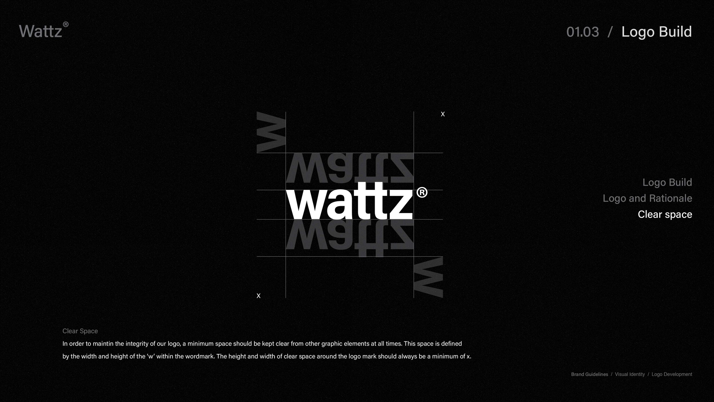
The Logo Build
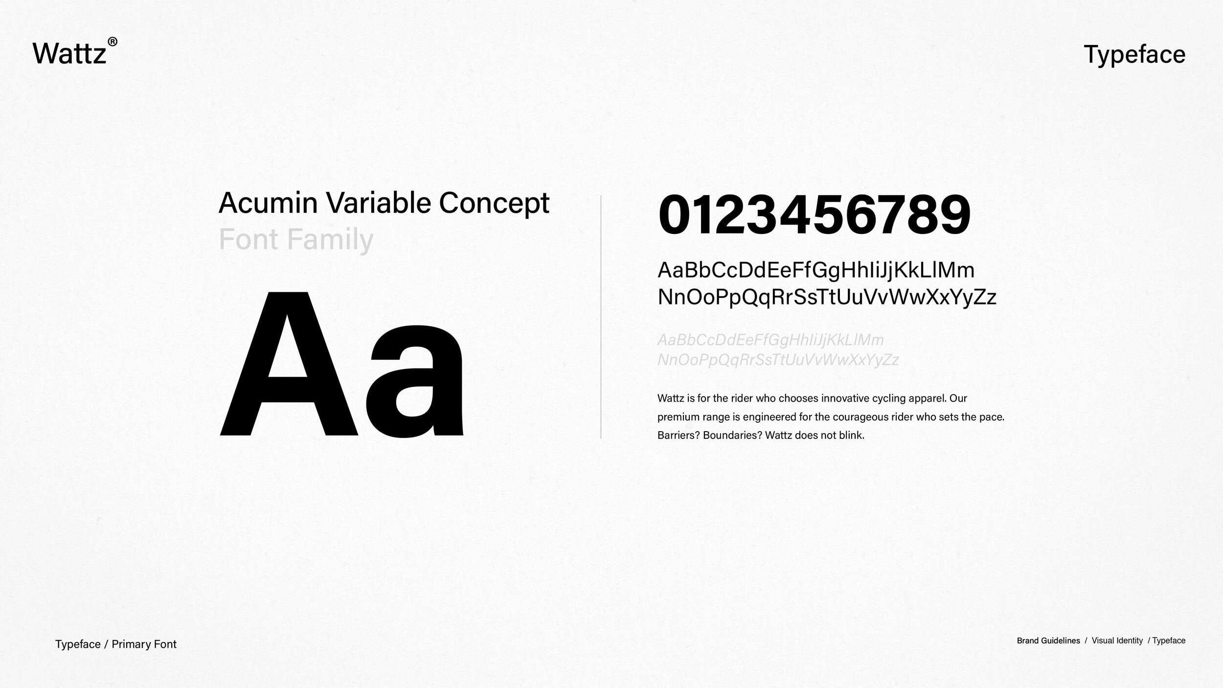
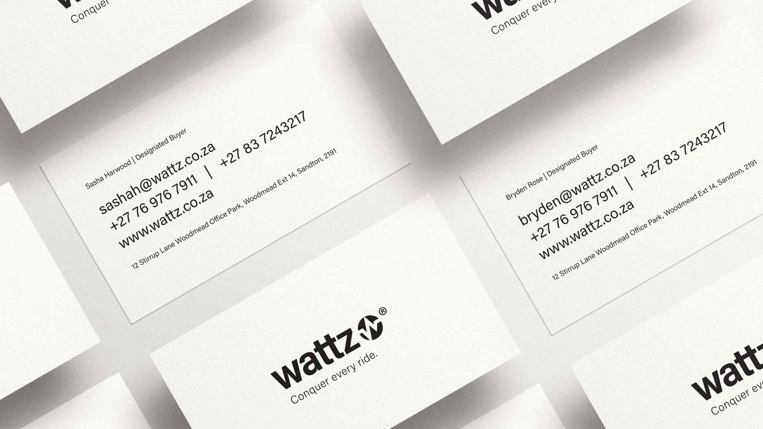
The ‘w’ from ‘Wattz” is combined with a heart rate line and a mountain peak. The logo result symbolises that Wattz apparel is made for people that are not just living, but are seeking to feel alive. With ultra-light fabric that allows its customers to ride fast and feel comfortable, they can conquer any challenge on their bike, their heart rates pulse, and the feeling of living life to its fullest is all encompassing. The font used in the wordmark almost appears as the ever trustworthy Helvetica®; known for its clean and modern look. The choice for Acumin Variable as a font choice is because, like Helvetica®, it doesn’t have an expression of fashion. It is a font that can be used throughout the identity to let Wattz apparel speak for itself.